Colorcrayons
Apprentice
 On a bit of a hiatus, sorry. So busy
Posts: 110  Mana: Red
|
Post by Colorcrayons on Jul 31, 2015 21:02:17 GMT -6
Worked on a template for army cards and spell cards from scratch. I'm pooped. I favor full bleed cards and I think this is an improvement over the official cards, if I do say so myself. Any suggestions for changes? 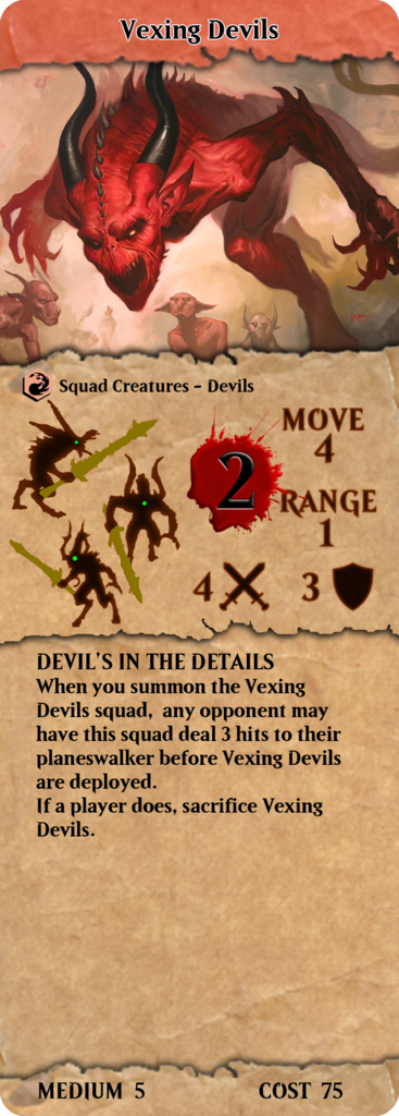 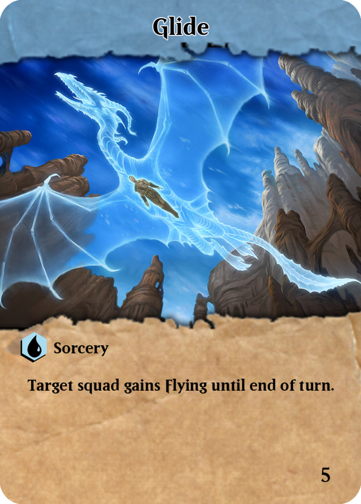 |
|
Jsanner2
Apprentice
Currently waiting in the Reserve
Posts: 66
|
Post by Jsanner2 on Jul 31, 2015 22:48:54 GMT -6
Hey, those are super neat! Don't forget the "individual" figure cost for squads and the little set symbol, though I think the symbol could be better located than it is on the official cards.
|
|
Colorcrayons
Apprentice
On a bit of a hiatus, sorry. So busy
Posts: 110
Mana: Red
|
Post by Colorcrayons on Jul 31, 2015 23:14:59 GMT -6
Crap, I forgot about the stupid Unique/common symbols. I might just type out "Unique Squad Creature" on the cards instead. I hate those symbols. I totally forgot about individual fig cost too. I think I'll just leave the set symbols off, or just make a tiny colorcrayon symbol. A bit of trivia: the blood spatter has a mans face screaming to the left. I wasn't satisfied with the headers, so I took a few more mins and made something better for all the colors, with a nod to the original cards:  |
|
Colorcrayons
Apprentice
On a bit of a hiatus, sorry. So busy
Posts: 110
Mana: Red
|
Post by Colorcrayons on Aug 1, 2015 14:04:33 GMT -6
Ok. Added the individual fig points cost, and made a bad attempt at the unique squad symbol that will have to suffice until I get a better example of it. Any suggestions graphicdesignwise?  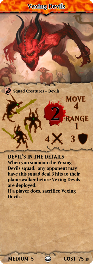 |
|
|
|
Post by Yawgmoth on Aug 1, 2015 17:13:20 GMT -6
I think the text box on the spells is a bit on the slim side. How many words can you fit in it? Have you tried putting a lengthy spell in there? Maybe it's just the bold text that's throwing me off. Regardless, I like the parchment. It's like you're looking down at a scroll you unwrapped to read a spell to cast it, then you look up over your scroll to see the effect of your  as pictured. Pretty neat. The new title bar is an improvement over the old. I think the torn edges could use some sharpening, if that's possible. I like these emphatically more than the official cards. Will you be sharing the template? What program are you using? |
|
Colorcrayons
Apprentice
On a bit of a hiatus, sorry. So busy
Posts: 110
Mana: Red
|
Post by Colorcrayons on Aug 12, 2015 0:45:26 GMT -6
I've decided to update the format a bit. I beleive the mixture of iconography and words doesn't suit consistent design, so I went with all iconography to represent Move & Range. Tightened up space a bit by overlaying the icons with the stat scores, allowing the scores to be larger and hopefully more legible. And as a nod to the original Heroscape, I gave the scores of each the color corresponding to what they were in Heroscape. Range is  , move is grey, defense/  is  , attack/ is  . I beleive the choice of icons makes the stats readily identifiable. But what say you? Any opinions? 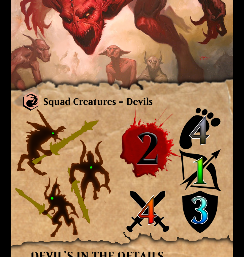 I think the text box on the spells is a bit on the slim side. How many words can you fit in it? Have you tried putting a lengthy spell in there? Maybe it's just the bold text that's throwing me off. Regardless, I like the parchment. It's like you're looking down at a scroll you unwrapped to read a spell to cast it, then you look up over your scroll to see the effect of your as pictured. Pretty neat. The new title bar is an improvement over the old. I think the torn edges could use some sharpening, if that's possible. I like these emphatically more than the official cards. Will you be sharing the template? What program are you using? I haven't checked the word limit of the text boxes for army/spell cards I dont think I can throw three abilities in there though without reducing font size. Thanks for the compliments. I don't see why not. I am using Photoshop CS2. (I'm still using a Windows XP box) I hear you can use gimp with PSD files, but haven't checked it for myself. You can actually get the Adobe CS2 suite for free on their website. Long story as to why, but it's quite legit. |
|
Colorcrayons
Apprentice
On a bit of a hiatus, sorry. So busy
Posts: 110
Mana: Red
|
Post by Colorcrayons on Aug 12, 2015 1:26:10 GMT -6
Side by side comparison: 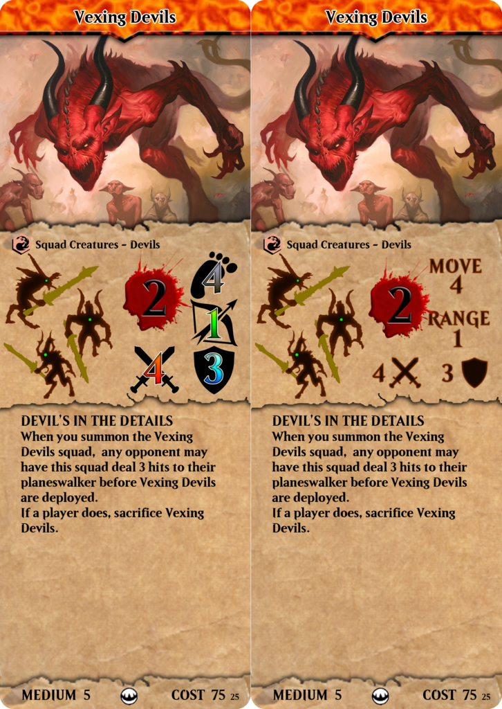 |
|
Colorcrayons
Apprentice
On a bit of a hiatus, sorry. So busy
Posts: 110
Mana: Red
|
Post by Colorcrayons on Aug 12, 2015 13:09:31 GMT -6
Did a bit more work as I have never been happy with how Hasbro laid out the stats on the cards. Messy. I am happy with this, but would like feedback from others to tell me if legibility is being sacrificed, or if it's just aesthetically unpleasing. 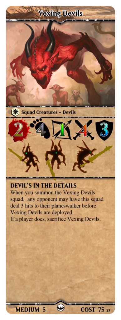 |
|
|
|
Post by Yawgmoth on Aug 12, 2015 19:16:05 GMT -6
I went ahead and printed it out to scale. Other than photo buckets horrible compression that loses detail, I quite like this most recent incarnation.
The symbols are clear as to what they are.
This brings it closer to feeling like magic, somehow. Mostly because the colors of the stat scores match the five mama colors, and because we often refer to some creatures as a "2/2" or 5/6". Now we have "2/4/1/4/3" creatures. Heh.
They are large enough to be legible, and the figs outlines are no longer cramped.
It works. Great design mod.
I kinda miss the torn paper, but I do like how this brings it closer in line with official army cards.
Can't wait to make my own squads using this.
|
|
|
|
Post by bluecloud2k2 on Nov 6, 2015 14:40:40 GMT -6
Is this template available for download?
|
|
|
|
Post by bluecloud2k2 on Nov 6, 2015 14:49:24 GMT -6
Did a bit more work as I have never been happy with how Hasbro laid out the stats on the cards. Messy. I am happy with this, but would like feedback from others to tell me if legibility is being sacrificed, or if it's just aesthetically unpleasing. Not sure if you noticed, but that's a creature on a  mana card... |
|
|
|
Post by darius on Jul 19, 2021 15:59:24 GMT -6
Is this template available for download? |
|


 as pictured. Pretty neat.
 , move is grey, defense/
 is
is  , attack/
 .
.
 mana card...